How To Change Branding With Reify Skin Editor
It’s easy to build and design sophisticated applications in Reify.
Branding them just got a whole lot easier with the online Skin Editor!
With the online Skin Editor, you can leverage the ability to cascade your changes to colors, font and borders to make wholesale adjustments with a simple click of a button.
You can see these changes instantly in both the editor and in Reify so you can quickly know how different settings will look together.
In this blog post, we take a deeper look at how our Skin Editor works and how you can leverage it to rapidly produce eye-catching skins in a fraction of the time it used to take.
Let’s get started!!
In Reify, access the online Skin Editor directly by selecting
Project-> Skin-> Open Skin Editor
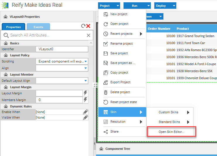
NOTE: You can go to skin editor directly by visiting https://create.reify.com/themes (you will still have to have to log in to an enabled Reify account to access the online editor, even if you navigate there directly).
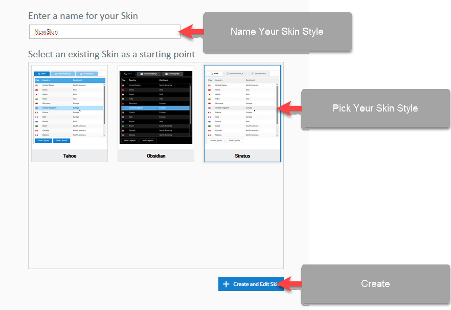
Create a New Theme
Pick an existing theme that is as close to the desired look and feel that you need, choose a name, and click Create. The theme will now be created for you automatically, ready for edit and the Skin Editor screen will be presented.
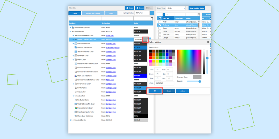
The Skin Editor management screen is split into 2 main areas:
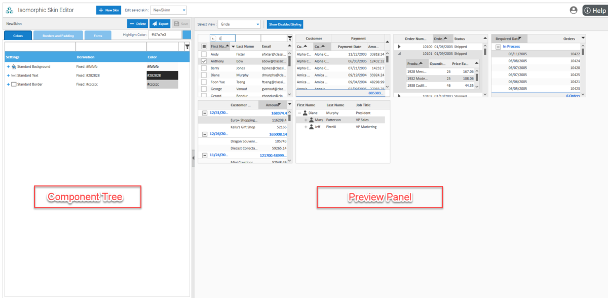
- Component Tree: A cascading list of color schemes, fonts, border and padding settings that affect every component in the skin. This includes interactive behavior colors such as rollover, button up, down, focus and many more.
- Preview Panel: A current and immediately updated view of how your changes to values in the Component Tree have affected the color schemes, borders, padding or fonts in the widgets and components on display.
Using the Component Tree
Open up the individual nodes to see all of the different elements that you can control.
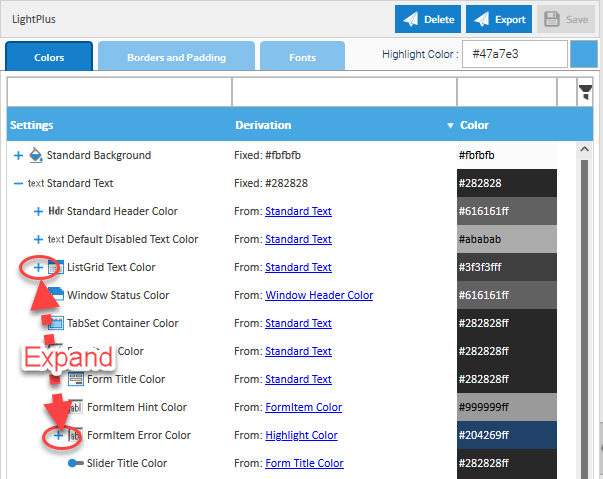
Filter the list so you can see just the elements you are interested in.
Use the built-in color picker to select a new color.
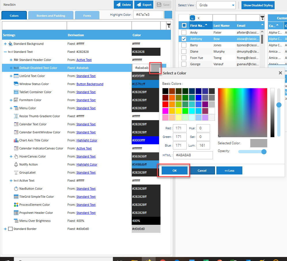
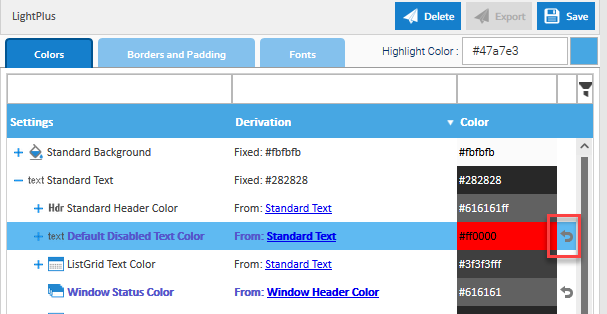
If you already know the color you want, simply click on the relevant component element, set your color ID and press enter to see your change immediately take effect.
If you don’t like the color, just revert the change – simple!!
Change border width or radius to get the desired look and feel you need. Borders and padding can be set at every component level for highly specific fine-tuning.
- Change the font you use or it’s size. Header and body text can be manipulated in this way for all components.
Change the font you use or it’s size. Header and body text can be manipulated in this way for all components.
Remember, all changes cascade down to any child elements associated with this component level, making development of your new skin fast, slick and easy.
Preview Panel
The Preview Panel is where your changes come to life. Change the selection of widgets you want to see so that you can individually model and control their color schemes, borders and fonts.
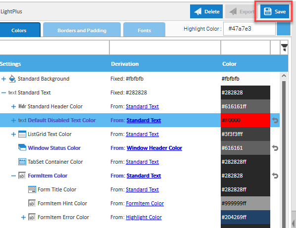
Save your changes as you go so you can return to your skin at any time to continue your work, without losing anything you’ve already done.
Once you’ve finished designing your new skin, or even if you just want to see “how it looks” in your Reify application, simply select it as a custom skin and see the changes instantly get applied.
Get a demo of Reify
Experience a live demonstration of the Reify low-code platform customized to your specific needs!